"The observation was generalized into a theory: insofar as the formal properties of different languages are different from one another, each of the world's languages gives access to a different mental world." (Bellos, “How Many Words Do We Have for Coffee?”)
I agree with this quote - there are different mental models embedded within languages (words) themselves - from how we perceive time, to how we give directions, and describe our surroundings.
"To expand our minds and to become more civilized members of the human race, we should learn as many different languages as we can. The diversity of tongue is a treasure and a resource for thinking new thoughts." (Bellos, “How Many Words Do We Have for Coffee?”)
That's true that learning new languages opens up a door to learning new philosophies and worldviews, therefore, knowing multiple languages makes you more well-rounded.
"The lack of a one-to-one relationship between countries, languages, and scripts means that designers must consider both language and country as potential determinants of design. The multitude of permutations of language, dialect, country, and script has implications for at least two key aspects of an internationalization project: language rendering and translation." (Aykin, "Practical Issues and Guidelines for International Information Display")
Sometimes the country is the same, but there may be several dialects or scripts within that same country (Japan, China), so that's a very good point. Designers need to consider not only the translation aspects of internationalization, but also the look and structural adaptation (as in numerical, nominal, etc.) of text.
2. Explorations
As I was reading about Edward Sapir's theory of language equality, I remembered the universal grammar theory by Chomsky, which basically states that the human brain is hardwired for grammar from birth, so all languages have certain common principles. This one more time supports the idea of language equality in the sense of the ability for deep thought and expression. The rest (prestige vs. primitivity) are just labels given to languages based on their economic/political power and influence.
Reading a bit more about language adaptation in UX, I stumbled upon this article with tips for UX writing. In this article, two key points stood out to me as important for localization: jargon and humor. Jargon is never a good idea to use, especially in those cultures that do not have advanced technical skills, while humor is generally good, but it's very specific to the culture (can be misinterpreted) and can get annoying when it appears as part of error messages/notifications.
3. Notes
Below is my summary of important notes from the readings this week. These include some facts, history, and tips that I find interesting and important.
- Different language = different mental world (e.g., no terms for "left" and "right", but cardinal orientation instead - North, South, East, West, etc.)
- Grammatical category of evidentials (Hopi language) - marking whether the noun is in the field of vision
- Old hypothesis: primitive languages are not suited to higher thought because they seem to be deficient in conceptual words (e.g., "past", "time", "law", "God"). These primitive languages are concrete and lack in abstraction.
- The European drive toward standard languages put "primitive" languages under the threat of extinction due to economic, political, urbanization causes
- BUT: Edward Sapir: "All languages are equal", based on his long study of languages. There are no patterns of similarity and/or complexity that distinguishes them. They simply construct different mental models, which are equally valid for their own contexts.
- Translation DOWN: towards a vernacular/a language with lesser cultural, economic, or religious prestige. Translating down leaves a visible residue of the source (prestige) language.
- Translating down used for practical reasons - from the language of dominance to the languages used by peoples living within the field of domination (the USSR literature was made availible in Kazakh, Ingush, etc. languages of the Republics)
- Most translations done today are translations down (from "more prestigious/dominant" languages like English, German, French)
- Translation UP: towards the more general/prestige tongue. Erases most of the text's foreign origin.
- Formal equivalence: translation in which common meanings closely correspond to the source language
- Dynamic equivalence: the translator substitutes some expressions with roughly the same meaning in the receiving society (this is practiced more in translating down). It often uses localized word substitutions. This is why Bible in Greek or Latin is closer to the essence of meaning than in vernacular translations (English).
- Nearly 80% of all translations in all directions (over a decade) are from English
Internationalization Guide - Things to Consider
- Language (dialects and scripts within a single language)
- Character sets (ASCII, ISO, Unicode, UT8-8, etc.)
- Fonts (use simple fonts and leave enough space between lines and letters)
- Text orientation
- Local paper/screen size
- Hardware (printers, keyboard styles)
- Translation (abbreviations, spelling, word size/spacing, names/address formats, number formatting, calendar/holidays, etc.)
4. Exercises
Fitbit app - adapting for Brazil.
Icons
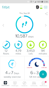
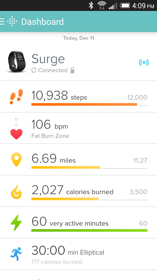
- Since the dashboard of the app is icon-heavy, I would research if these images have the same interpretation in Brazil, and if not, redesign them to make sure they are understood. These seem to be pretty neutral at first glance. The two icons I'm most concerned about are the two green icons (see above) that are meant to represent calorie burn and the time being active. The calorie burn icon looks like a water droplet (although it's supposed to look like a little fire). I made sure that the literal translation of the English "burn" is the same in Portuguese (otherwise it wouldn't even make sense to make it look like fire), and it is the same meaning ("queimar" = burn). Making it look more like fire would be my recommendation (as on the screen below). It's interesting that FitBit uses these two slightly different icons interchangeably. I would recommend switching out the one on the main dashboard to the one seen below and sticking to it throughout the entire UI. The second questionable icon is the one representing power/energy. I did some more linguistic research, and it seems that the icon should be appropriate, since the use of Portuguese words for "power" and "energy" ("poder" and "energia") are also used to mean the same concept, and googling Portuguese icons for "energia" has revealed the exact same representation.
Language
- The words used on the main dashboard in the English version are pretty short or use short versions ("cals" for "calories", etc.). I translated these words into Portuguese, and they are pretty much the same length (calories, escapes, minutos, milhas). Since the U.S. UI is very simplistic, there shouldn't be a problem with direct translation of the annotated icons and at the same time keeping the same spacing between them and the general look.
- One word that needs to be changed is "miles" into "kilometers", because that's the measurement people in Brazil use (km).

Color
In terms of color choices, Brazil's favorite colors are bright green and yellow, which the current UI offers, so I'd recommend keeping that. The purplish-blue color used to represent the sleep cycle in the examples above needs to be changed in hue to blue (maybe with a teal tint?), because in Brazil, purple is associated with death and mourning. That is certainly not the association Brazilians would want looking at their sleep patterns.
Date and time format


The date format of the workout (January 23) from the example above (on the right) would have to be switched around, as follows: 23 de Janeiro. The time format in the upper left example (6:46pm) would have to be changed to the 24-hour format that Brazilians use, as follows: 18:46.
Additional functionality
Secondary research on wearable technology in Brazil states that many Brazilians would like to not only track their physical, but also mental progress: "The health and wellness trend was no novelty among Brazilians but became reality for many. Health and wellness-orientated consumers are quick to demand new interactive ways to track their physical and mental health as well as physical activity and the increase in volume underpins the gradual entry of these devices into individuals’ daily lives."
For design, this could mean introducing a way to track mental states, for example, by allowing the users to log their mental states daily (marking their emotional state on a happy-down scale), so that the app could provide them with a recommendation or warning if their mental state becomes concerning.
Metrics tracked
Additional research is needed to determine what metrics the users would want to track and self-input (calories eaten, water intake, etc.)
Forums seem to be a good way to research important metrics, but not all relevant content that I found was in English.
Food (calorie) log
I found one thread with users' feedback about Fitbits not having Brazilian food in the database for calorie intake measurements. This could be solved by including local popular foods in the local database (moqueca, brigadeiros, quindim, etc.)
Goals

The question is, would we let the users set and adjust their exercise goals or pre-set them for them?
This seems to de dependent on Hofstede's Power Distance metric. According to Hofstede Insights, Brazil's Power Distance is almost twice as high as the USA metric, meaning that the users might want somebody making decisions for them more so than in the US (for somebody else to be in charge and guiding them), so for the FitBit app that could mean offering pre-set goals that the users can choose from, or set them for the users based on a quiz/calculated level of activity, calorie intake, and body index. For example, the app could pre-fill (as a suggestion) the user's goals based on personal data, but make them editable, so the user doesn't feel restricted.
Notifications
The types of notifications that the users would like to receive, if any, are pretty hard to determine via secondary resarch.
I would research this during usability testing and qual interviews, where I'd ask users what kind of warning or feedback they would like to receive, and I would test a few different options with them.
Style
Based on several Brazilian forum comments, it seems like FitBits are still symbols of status as they can't be easily acquired in Brazil and are often brought from the USA. Brazil is a high indulgence country: "While the current recession has certainly dampened Brazil’s impulsive buying tendencies, the Brazilian spirit won’t be quelled in the long run. A high indulgence suggests that Brazilians’ emotional, passionate nature lends itself toward enjoying life. Despite financial strains, Brazilians still believe in living life to the fullest through leisure time, having fun, and splurging occasionally"
With that "symbol of prestige" thinking in mind, FitBit designers could use that to their business advantage by introducing Fitbit bracelets that truly look and feel luxurious (stainless steel, rhinestones, leather, etc.) so that Brazilians could feel/showcase the status of owning such a device.
Socialization
Since Brazilians love socializing (Brazil is a highly collectivist society), it's recommended to add an element of friendly competition/rating/sharing, where the user can easily share their data with friends or set group goals that the users can work towards together, as opposed to individually. For example, one user can set "challenges" for his/her friend and once the friend completes it, he/she gets a bonus and can set a challenge for his/her friend in return.
Challenges
1. The language - searching something in English doesn't yield many answers, especially for visual (icons) validation. This information would need to be double-checked and tested with the native speakers.
2. The language issue can be overcome by reading/buying reports highlighting insights for international markets. Usually you have to pay to get access to the report, but major insights can be summarized in the description.
3. The notifications and feedback desired by the users is hard to research through secondary research, even in the local environment for local users. I would conduct user testing for them - there is no way around it, unless you are a Brazilian and know for sure what you'd like to see.
4. Even though that language is a major barrier, some multilingual speakers post their issues and feedback on English forums, and I found some of the threads to be culturally helpful scrolling through.
5. Inspirations
I really love reading about different languages, especially about isolated and rare ones, as they carry so much culture and unique worldviews. As a former linguist who taught English to ESL speakers, I've read quite a few books and research papers on the specifics of their grammar/syntax, but have never gotten to learn one of such languages. There was a student in my linguistics class once who studied Paiute (one of the Native Indian languages), and I have always thought that was very cool, since she was learning it not just for the sake of learning, but also teaching it to preserve it, since these indigenous languages are endangered. I would like to learn a language like that. It would also be interesting to explore how technology fits into these less dominant languages/cultures.
No comments:
Post a Comment